

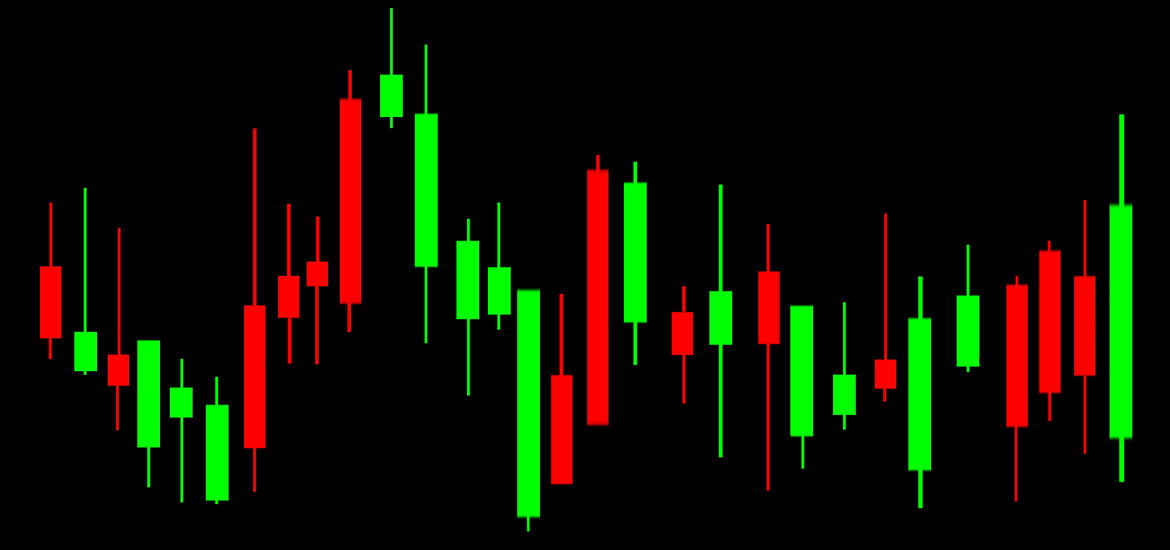
If you trade with crypto currencies, candlestick charts are used to analyse price developments. A chart contains five relevant pieces of information for traders. The bar charts with their red and green elements graphically resemble candlesticks, hence the name. This method of analysis was invented as early as the 17th century and is still a widely used instrument for price analysis today. But how can you understand such a chart?
The colour of the candle body indicates whether the buyers or the sellers predominate. Green here means more dynamic on the part of the buyers and thus a tendency for rising prices. Red stands for more sellers and thus probably falling prices. The upper and lower sides of the candle body mark the price range at which a crypto currency was traded in the defined time corridor. The wicks (thin lines) that continue the candle body indicate how far the prices were traded in an individually defined time corridor. With these details it is immediately apparent in which direction the market is tending and above all at which prices.


Leave A Comment
You must be logged in to post a comment.